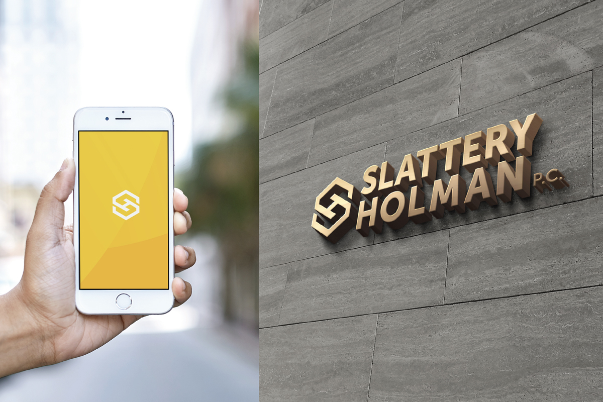
It’s no secret that we love logo designs that have a purpose and meaning built right into it. The goal was to create a new visual identity that reflected this this boutique accounting firm’s name, vision, and values of providing excellent client service relationships and are consistently going the extra mile.
Rationale for the Final Logo Design:
The symmetry and balance of a hexagon-shaped graphic is partitioned into two equal parts that transform into the “S” and the “H” of the wordmark. The two halves merging together are a graphic simplification of the relationship between the “S and the “H” and articulates the Slattery & Holman brand purpose, one part “identifying needs” and one part “exceeding expectations”.